Stop Painting Rooms One at a Time: A Simple Formula for a Whole-Home Color Palette
Walk into a home where every room was painted in isolation and you can feel it — that slightly off rhythm, like a playlist that skips between genres with no transition. The good news? You don't need an interior designer (or a repaint-the-whole-house budget) to fix it. You just need a plan.
We call it the color story method, and it's the closest thing we've found to a foolproof way to make an entire home feel considered, connected, and calm.
Start With the Room You See Most
Every palette needs an anchor, and the anchor should be the space that sets the tone the moment someone walks in. For most homes, that's either the living room or the kitchen.
Pick your hero color here first — the shade you genuinely love, not the one you think you're supposed to love. Maybe it's the sage green that's been quietly taking over Pinterest, or a warm greige that plays nicely with your existing sofa. Whatever it is, this color becomes the thread that runs through the rest of your home.
The 60-30-10 Rule, Explained Like a Friend Would
You've probably heard of this ratio before, but here's what it actually looks like in practice:
- 60% dominant color: Your walls, large rugs, and big furniture pieces. Think whites, creams, soft neutrals, or a muted version of your hero shade.
- 30% secondary color: Your supporting act — curtains, accent chairs, bedding, an area rug. This is often where your hero color shows up.
- 10% accent: Pillows, art, ceramics, that one bold lamp. This is where you get to have fun.
The magic isn't in the exact percentages — nobody's measuring. It's in the discipline of limiting yourself to roughly three colors per room, pulled from a palette that repeats across the house.
Build a House Palette (Not a Room Palette)
Here's the shift that changes everything: instead of choosing colors room by room, choose one palette for the whole home, then rearrange it as you move through the space.
A workable house palette has five to seven colors:
- One or two whites or near-whites for walls and trim
- Two neutrals (a warm and a cool, so you have flexibility)
- Two to three accent colors that can travel — a deep blue in the dining room can become throw pillows in the primary bedroom
Take a classic American farmhouse palette: warm white walls, weathered wood tones, a soft blue-gray, and hits of black. In the entryway, the blue-gray might be a painted bench. In the kitchen, it's the island. In the living room, it's just a quilt draped over the arm of the couch. Same story, different chapters.
Swatching Without Regret
Before you commit a single gallon, do this:
- Grab peel-and-stick samples. Most major US retailers — Sherwin-Williams, Benjamin Moore, and Behr at The Home Depot — offer large, repositionable swatches that beat those tiny painted squares every time.
- Tape them to two walls in each room. One wall gets natural light, one doesn't. Colors shift dramatically depending on light, and north-facing rooms in particular can turn a warm white into a dingy gray.
- Live with them for 72 hours minimum. Morning light, evening lamplight, and overcast afternoons all tell a different story. Give each shade a full day before you decide how you feel about it.
- Check them against your fixed elements. Flooring, countertops, tile, and brick aren't going anywhere. Your palette needs to flatter them, not fight them.
Making Open Floor Plans Feel Intentional
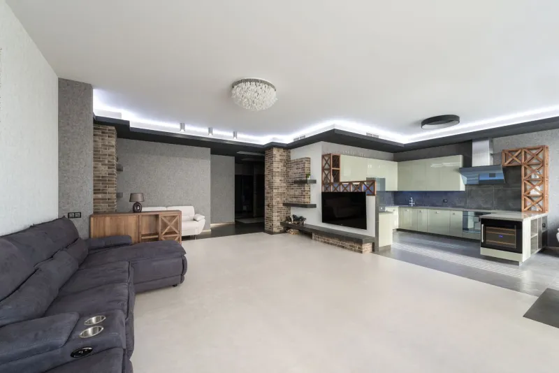
If your main living area is one big open space, the color story method is practically mandatory — but that doesn't mean everything has to match perfectly.
The trick is continuity with variation. Keep walls in the same or very similar shade across the open space, then use your secondary and accent colors to define zones. A deeper tone in the dining nook, a patterned rug under the seating area, painted cabinet fronts in the kitchen. Your eye reads these as distinct spaces while your brain registers the harmony.
One shortcut we love: repeat at least one color in every sightline. If you can stand in the hallway and spot both the navy in the living room and the navy in the kitchen, you've done it right.
A Real Example, Entryway to Kitchen
Here's a palette one of our editors used in a 1960s ranch:
- Base: Soft warm white (Benjamin Moore White Dove vibes)
- Neutral: Warm wood tones and rattan
- Traveling accent: Dusty blue (think Behr's popular blue-grays)
- Second accent: Terracotta, used sparingly
The entryway got a dusty blue door and a wood bench. The living room stayed white with blue and terracotta pillows. The kitchen island went dusty blue while the perimeter cabinets stayed white. The hallway? All white, with a terracotta runner. Four spaces, one story.
The Best Part: It's Budget-Friendly
Because a whole-home palette leans on repetition, you can shop your own house first. That blue throw in the guest room? It belongs in the living room now. Swap pillow covers, move a rug, repaint one piece of furniture in your accent shade — small moves, big cohesion.
A beautiful home doesn't come from more stuff. It comes from a plan. Pick your palette, let it travel, and watch your rooms start talking to each other.